Wednesday, May 27, 2009

Design Book


Superman Cowboy-2009- Ikey Chafkin-U.S. of A

The story that is in my book is the story of man from the U.S. looking for some advantage. The man goes to the middle east to find some fun. While there he meets a man whos son was kidnapped and so the man decides to help find the kid an beat up the kidnapper.

Making the book was not that hard it was just about using paper the same to pieces of paper for every frame.

The principles of design ar crucial in telling any story. I used emphasis to show a fight i foucuesd on the fist and the two peoples faces and i also used it to show the power of the punch through color. Overall i felt the picture turned out very nicely.


Super Duper Family-2009- Ikey Chafkin - U.S. of A

I think the decisons i made about making this picture really helped show how my family is very different but also very similar. Giving everybody a super power gave them and indivuality that distinguishes their role in the family. And this justice league setting shows how all the powers are useless if we don's have each other.

I think the strongest aspect of my picture is just drawing my family. I usally have a hard time just making people and faces but i feel like i really came through in this. Showing defention in the faces and all throughout the bodies. I think everything worked out and it came out to being a great picture.

Clay Bear and Lacrosse Player


Laxer and Black Bear-2009- Ikey Chafkin- U.S. of A
I feel like the Lacrosse player and the bear where both very sucessful. The bear came out great and I think the black just added to its scaryness and it also just ended up looking very nice. The lacrosse player came out very nice as well i think most of it held together well even though it was made up of so many pieces.
I think however there where problems in both of them. The detail on both failed to show after the coats of paint and if I was able to spend more time i would have like to spend more time making the indentations much more visable. The lacrosse player I feel came out worse than the bear i think that just had to do with him being so tall and being human with shapes like the helmet and the lacrosse stick also just being straight up.

Block Print

Wrestling-2009-Ikey Chafkin- U.S. of A

This picture was personally my best. I felt like better pictures would have come out. one of the big things that happened was it not all lining up even. It was not a problem at the early stages then towards the end it became harder and harder thant is why there are green and yellow spots all over the page. Other wise my color choice was very good. I think the red of the brick the blue of the mat and the gray of the mortor all came out very nicely. I am overall very happy with the end result.

Sunday, May 10, 2009

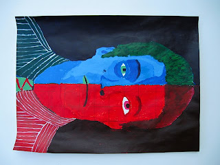
personal reflection:portrait

Self Portrait- Ikey Chafkin,2009- American

In my self portrait I tryed to capture the two different sides of me. The red side of my face represent my hot headedness, my cockiness and also my competative nature. The light side shows how I am a colected person and also shy sometimes.
This was a difficult painting at many times. I had trouble making a color to light or two dark like with my blue eye the dark blue makes me look elderly. The lines on my dress shirt where also difficult, because i had to make the lines at different angles to show how my shirt is positioned on my body. and over just shadding on the red side of the face.
In the picture I would have liked to spend a little more time on it. i also think that the red side of my face there is not a lot of visible lines to distinguishe my cheeks and the rest of my body like on the blue side. Overall though I think the painting turned out great.

Sunday, April 26, 2009

Sculptures and Textures

A Bronze Statue of the Hindu Deitie Ganesh,5th Century AD, Artist Unknown, India
Ganesh is the good of domestic harmony and sucsess, Ganesh is also prayed to first in all Hindu ceremonies. The artist of this particular piece seems to make his textures by using every small defined tools like a small point I do not know how do that because my back round in terra cotta. They most likely used a small pointy tool to carve out each symbol very slowly. The crown probably required the most work it does not seem all carved but molded as well the pants however are carved more.

Monday, April 20, 2009

3-D sculptures

Tom Otterness, New York- Large Covered Wagon, 2007

I like this piece the most of all the other pieces i have seen. I enjoy this peace because it looks so comical like the steer wearing boots. I think this makes the sculpture better, because I think art cannot only be flowers and sad people sometimes it needs to look like a kids book. Another thing that is appeling is the simple work that is done. It is cool how he does not go all out of this woman's face but instead goes simply into the iconic smiley face.

Tuesday, April 14, 2009

older and newer paintings


Puss and Boots- Walter Wick-2006-U.S.A.


Scottish-1848


Both a very similar in the way the artisits show the sky. The artisits also have their paintings seem very magical. A very cool aspect is also how the castles are not in your face but they are shown farthur away from ur view and the way both painting use leading lines somewhat to come up to the castels.
Both are very different however since the more modern one the colors are much brighter which makes it feel magic while the older painting resembles a layout for a architect.


Sunday, March 8, 2009

Nighthawks

Nighthawks- 1942- Edward Hopper U.S

First Impressons:when I first look at this painting i look at the man sitting with the lady in the red dress. I also just focus on everything in the diner. It is night time but it also seems like a very dark and gloomy time. You also start to look at everything in the resturant before u even notice the outside so I found that to be a very cool affect.

The Real Story: The painting actually does focus on the light and this painting is when florescent lights cam into play. Hopper was also try to portray a period of time in America call the "film noir" period. The "film noir" time was focused on crime and corruption in major metropalitan cities like New York where Hopper is orginally from.

How He Incoporated Some Principles: Symmetry and Asymmetry are not big things hopper focuses on. Neither half of the page is different and there is no radial balance because there is the large amount of light in one part of the paper. Hopper uses emphasis as a major part of this painting because the first thing your eyes go to is the people in the resturant. You focus on these people because of the lack of light outside. And the intense amount of light in the diner. There are no leading lines or repetion because Hopper just uses emphasis to foucs on the people in the diner.

Wednesday, February 25, 2009

Class reflection

I personally belive that my project that was most lacking was my collage. The reason I choose the collage is because i went in only using limited resources meaning i did not using the range of colors I had to the best of my abilites.
My favorite artist has to be Edward Hopper. Mr. Hoppers Art shows something very neat and unexpected with his use of shading and color like in his picture Nighthawks.

Thursday, February 19, 2009

sluculpture from non art material


Swiftly Tilting Planet 20- Sarah Sze
I really enjoy how this artist uses everyday material for her art like water bottles and desk lamps. For me it looks like a busy city but i think the message she is trying to get acrosse is how the planet is changing so much. But I still think the city is a much cooler idea. I like how one of the light focus right in the center and that is the only light in the entire piece. It seems very peaceful to me like looking out onto a big city like New York or Boston.

Sunday, February 1, 2009

self portraits

Bandaged Ear- Vincent Van Gogh(Dutch)-1889

First thoughts- I not ice he uses many different shades of green which is a very cool affect and the shade on his clothes is also very cool. His face and clothes all make him look like its very chilly. His face his very pale and stiff. When i first saw the bandage i thought it was for covering his ears in cold weather.

The Real Story- This is a painting when Vincent moved to Arles where he began to make some of his most beloved artwork and this portrait really kicked of his creative period.

Wednesday, January 21, 2009

Rising Son, Ikey Chafkin, 2009
This picture is of when I was little living in Tokyo and how i was a little red head boy all the girls loved me. The hardest part of this picture is the beans of red light coming from the little boy in the middle and having to spend hours on the hands. The Most succsesful part of the picture has to be the hands coming up looking like its a rock concert and the castles to the side which bring out the rest of the drawing.

Shading Picture

Ball made of Sun- Ikey Chafkin, 2009

The story that is going on in this picture is when I played little league baseball in California, this pirticular scene is when I caught a ball and i was staring right into the sun. the most challenging part was when I was trying to make the light look like sun and not a flood light. What I felt was done best was the player himself with the shading in the jersey and the shadow so little deatails on the player.

Monday, January 19, 2009

Telling a Story through Art

Nighthawks-1942- Edward Hopper

I Think- it portrays a hard working America during the Second World War. I think its about just people just coming to relax after a long day. The art work is very nice too. He makes you focus on what is going on in the dinner with bright colors and shading.

What the Real Story is- The painting refers to a term "Night Owl" who is someone that stays up late. It takes place in his hometown of Manhattan. Hopper painted it after Pearl Harbor which was a glommy time in American history, so Hopper shows these sad people just sitting and thinking.

Monday, January 12, 2009

Shades in art


Morning Sun by Edward hopper

i think: I enjoy this picture very much. it has this person in a lonely bedroom looking out onto the city and its very poetic because its like one spot of light coming through window like a light at the end of the tunnel.

what is really going on: It is about New york city Hoppers home and place of death. And it is also bout love hopper explained where the women is as "the lonely hearts hotel."

Sunday, January 4, 2009

Shape Art

Sorrows of the King, 1952 by Henri Matisse

What i think: I feel this painting is very cool it uses the colors in a very interesting way. The green and yellow are used as light colors to show what i believe to be light or hope and then you see the musican in black and the strange lizard thing in black which both seem very dark.

What it is Really About: it is actually about a song biblical hero named David and he plays Music to get the King Saul out of his sorrow and grief.